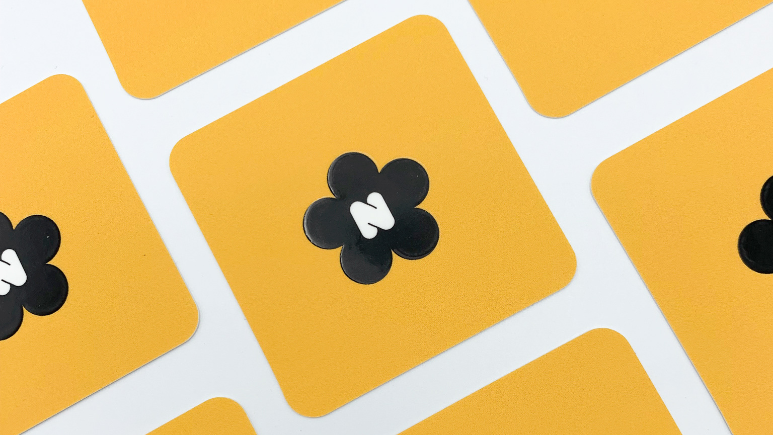
The Collective
Experimental Design | Brand Identity
Overview
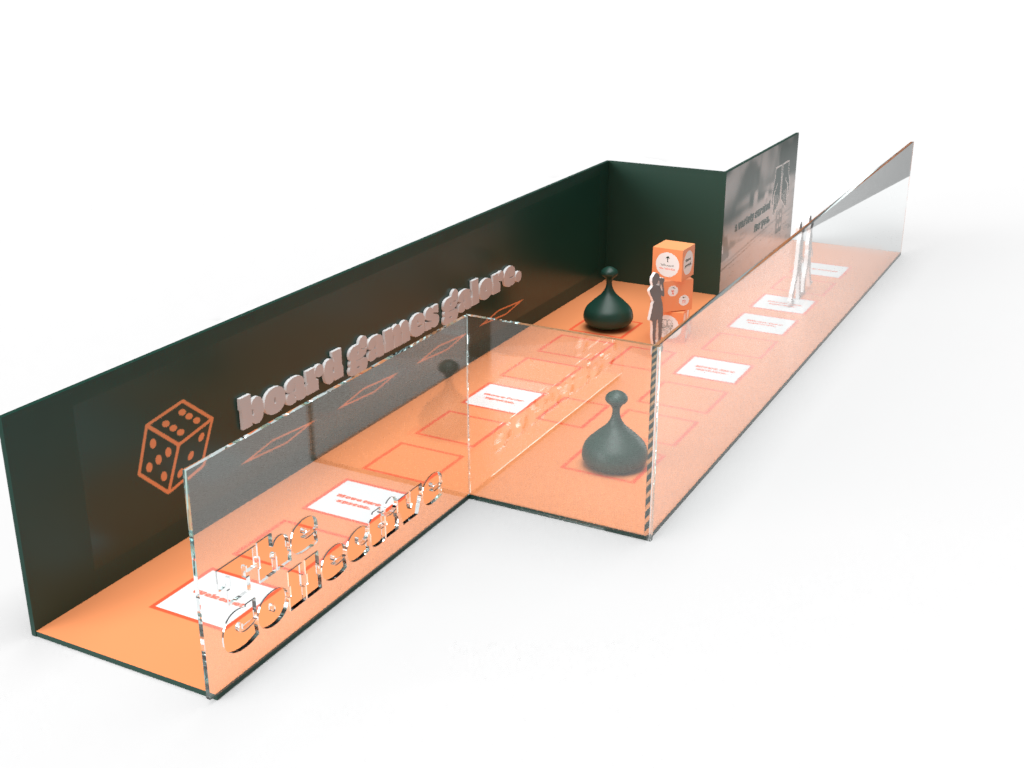
The Collective is a San Diego based convention concept that is held annually in the Downtown convention center. The goal of this event is to present a wide-range of audience with curated board games. This project focuses on the research, development, and execution of a brand identity that can be applied in a physical setting.
Research
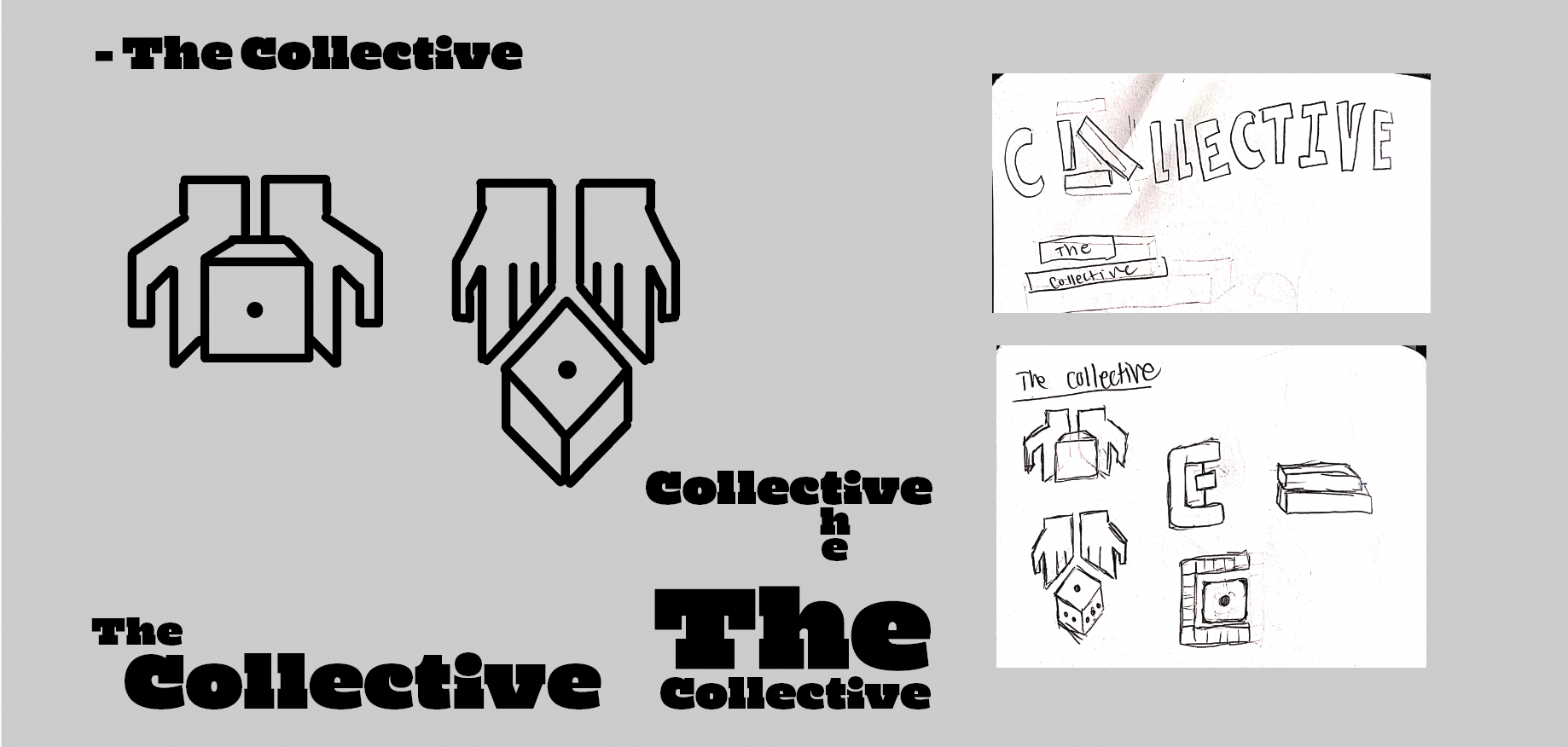
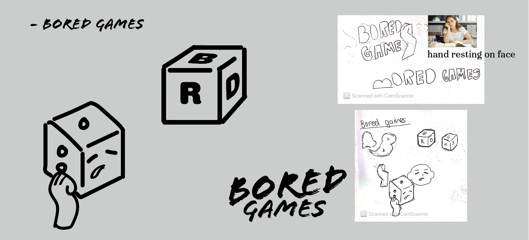
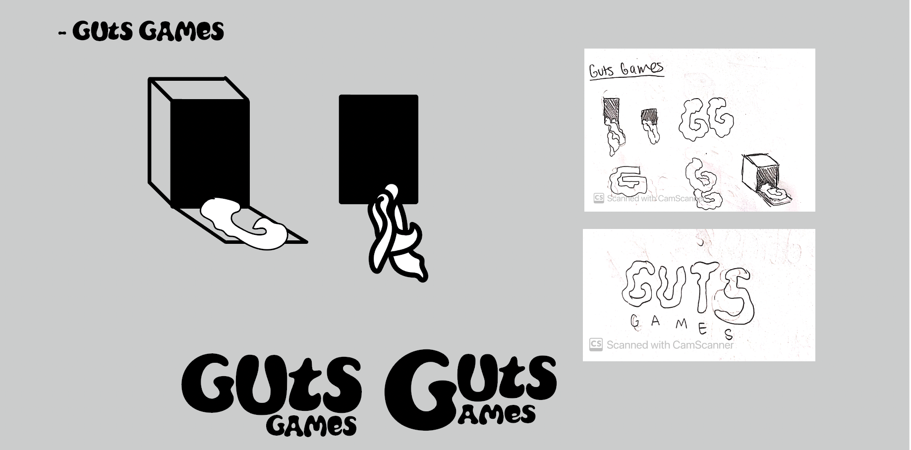
With the focus being board games, a series of names related to that was chosen. Sketches of possible iconography was made. From there, corresponding fonts were picked from a typeset sheet.
Final System
The final design set that was chosen was "The Collective." The name stems from the idea of the consumer's own collection of board games as well as the conventions collection that would be presented to them. The icon of dice was a main component found throughout the future design and logo as it is something recognizable for various audiences.
Typeface & Color Palette
The font used, "Mighty Slab" by Ryoichi Tsunekawa, was chosen as the main typeface. The playful curve of the C's and the I's, along with the sophistication of the serif perfectly described the audience of adults with a spirited passion for games. The secondary font was "New Atten Round" by Miles Newlyn. The font's roundness contrasts against the straight edge of the primary font but still pairs well with the smooth curvature of the letters like the E's and C's.
Orange would represent the bright and playful side of a person while green would represent a more mature, older side.
Final Applications
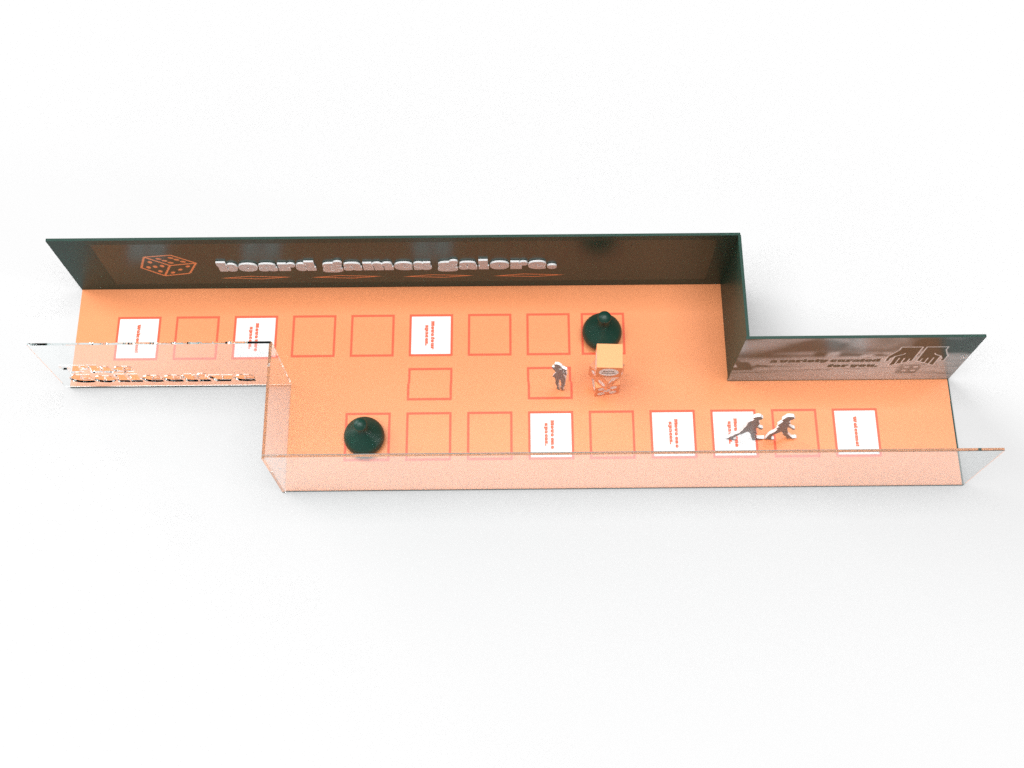
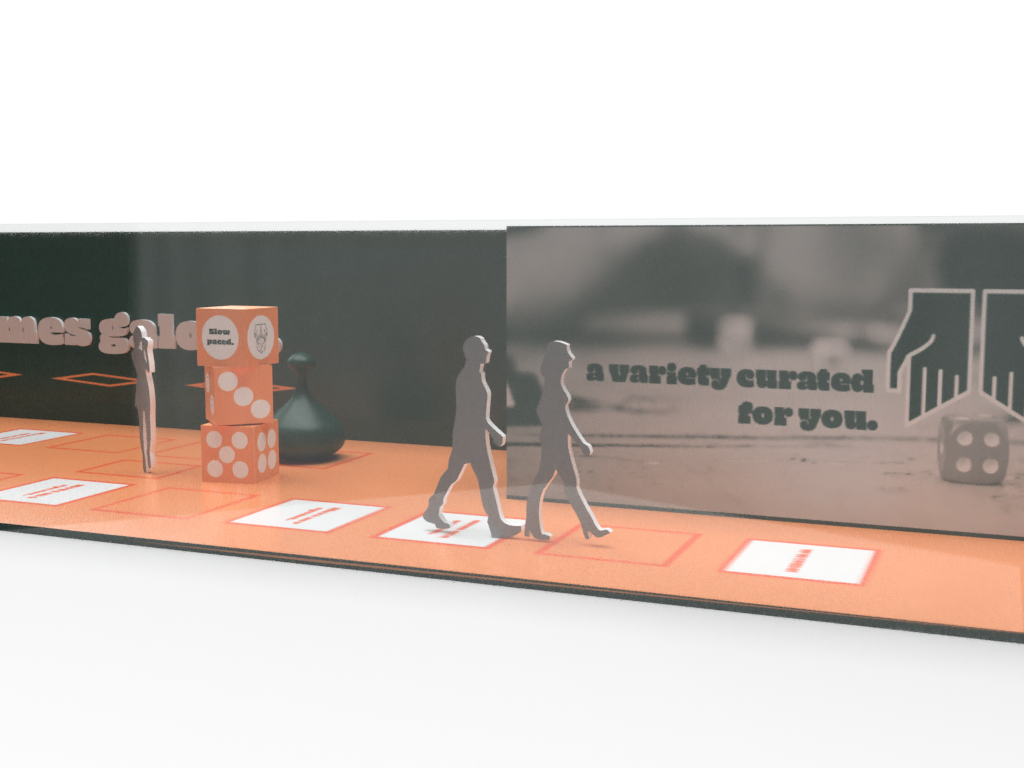
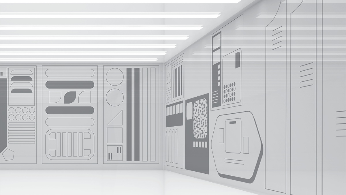
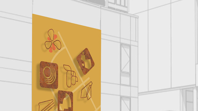
Aspects like advertising booklets, banners, kiosks, an entry hall, as well as a virtual experience was created.
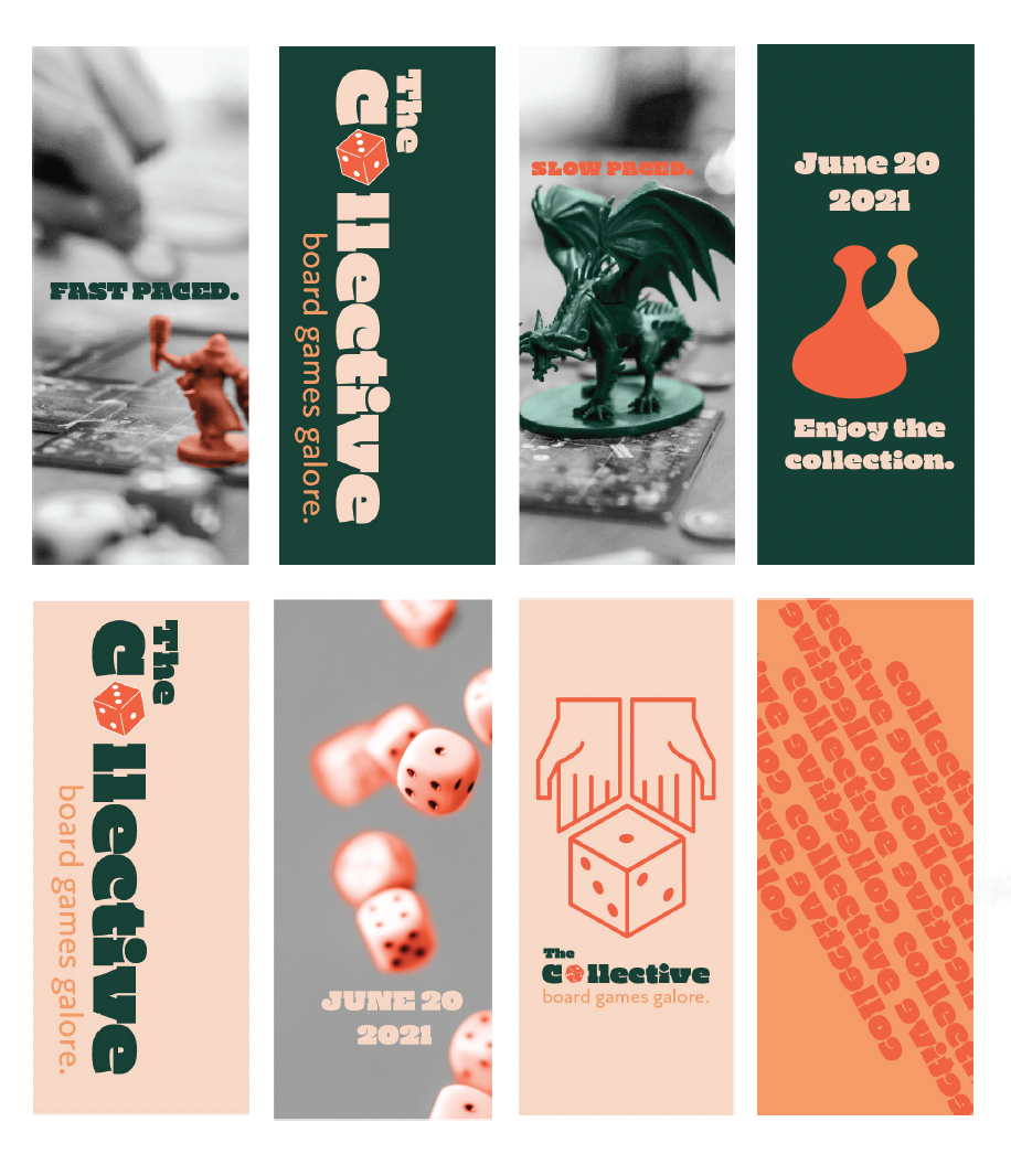
Banners
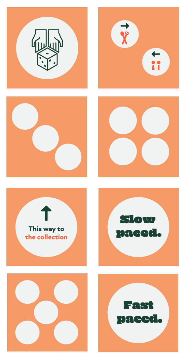
Kiosk
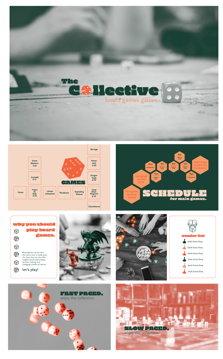
Booklet
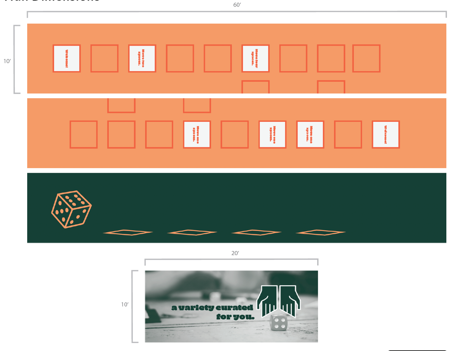
Entry Hall
Final Product
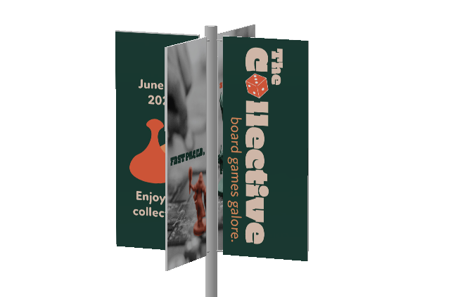
Banner 1 View
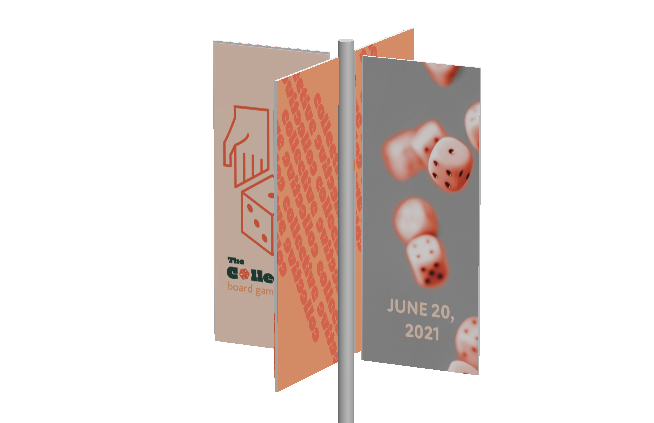
Banner 2 View
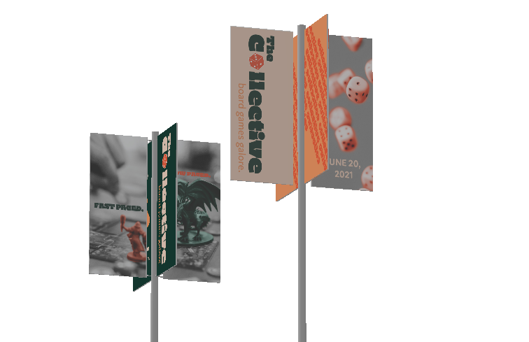
Banners
