

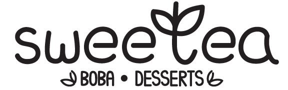
Sweetea
Brand Identity
Overview
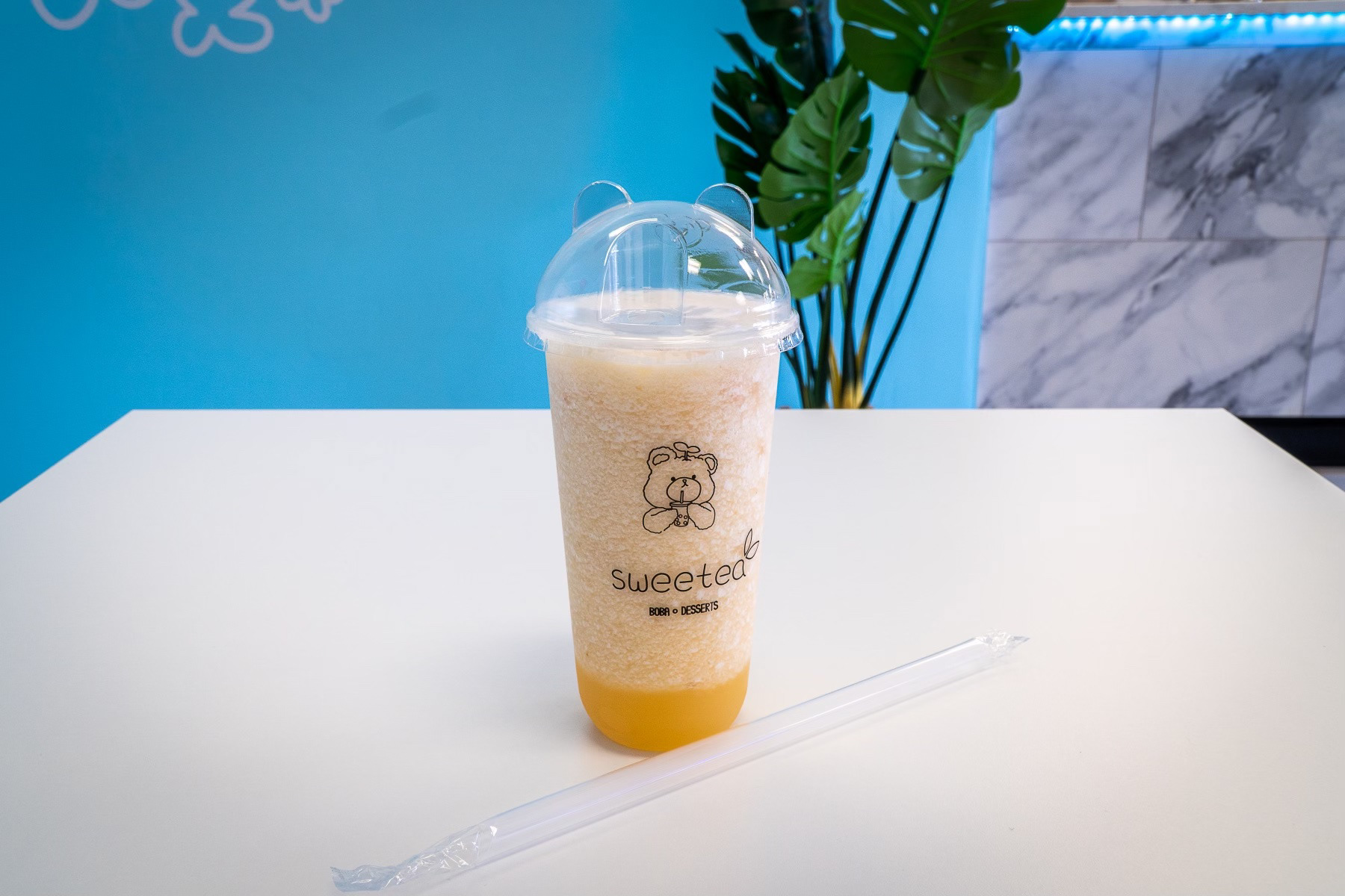
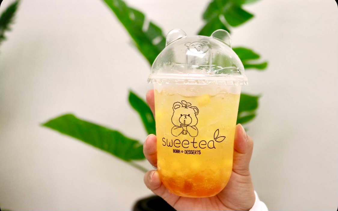
Sweetea is a boba brand based in the Sacramento area. With the adjectives "cute" and "aesthetic" being the main objective by the client, a solution that encompasses this was made. Creating a recognizable mascot and theme was essential.
Research
Boba, or bubble tea, has created its own culture where the aesthetics of the brand play a huge part in its success. With this in mind, extensive research was done on different stores in various countries.
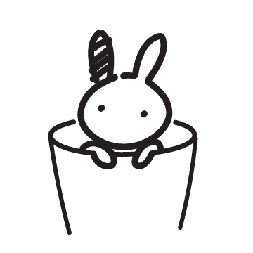
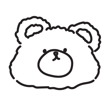
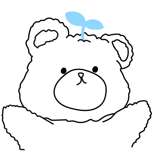
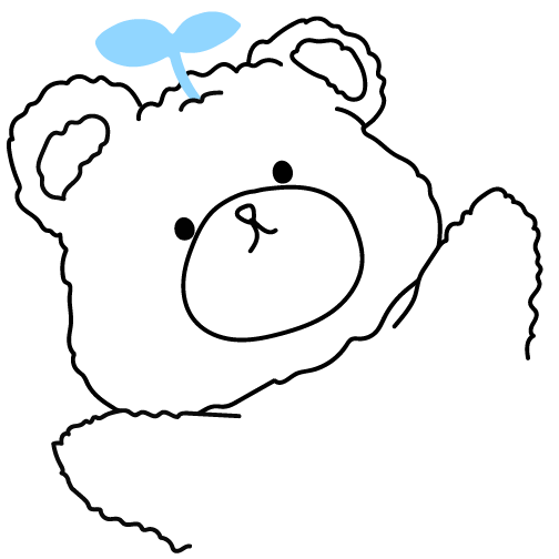
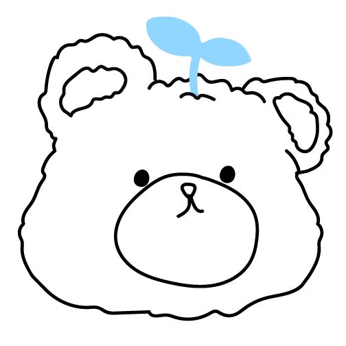
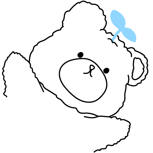
Mascot Sketches
Various animals were sketched for potential mascots as. Various recognizable animals were used.
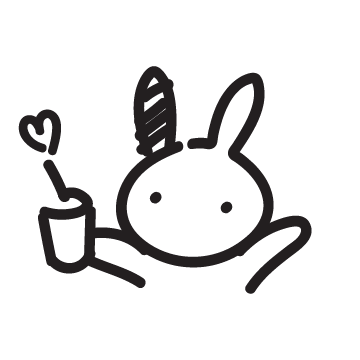

Bear shaped in an 8
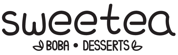
Logo Sketches
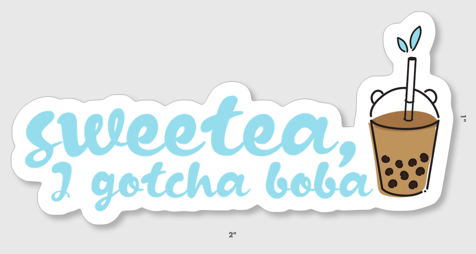
A hand written font was made to match the style of the mascot. Tea leaves were added in the designs to allow easier identification that it is a tea shop from afar for the consumers.
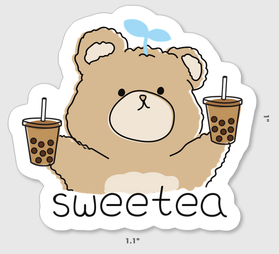
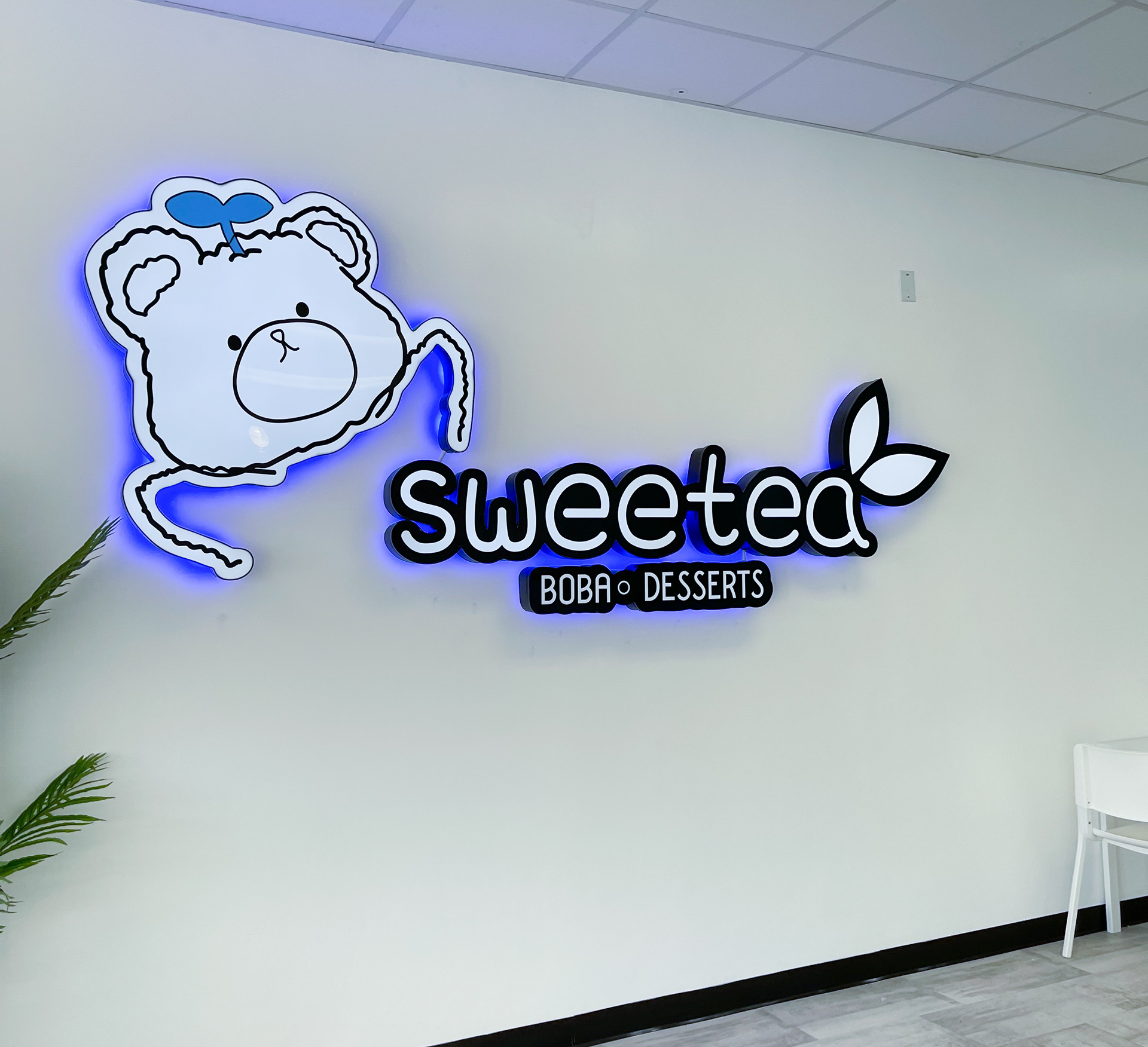
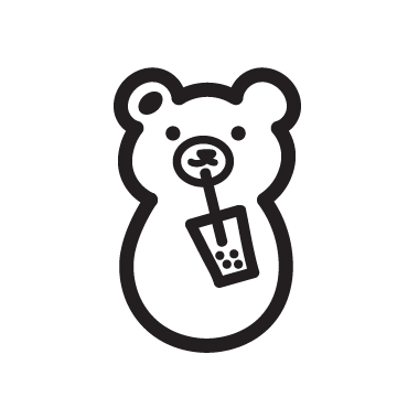
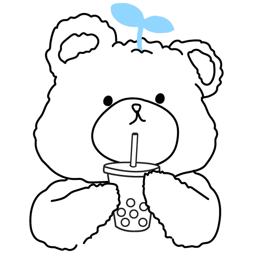
Final System
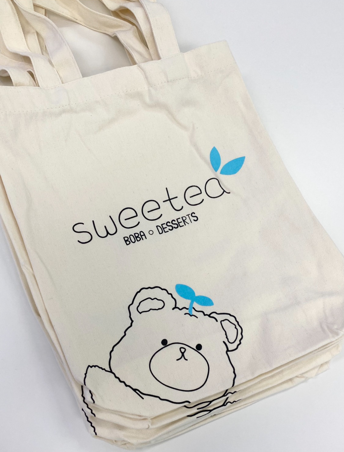
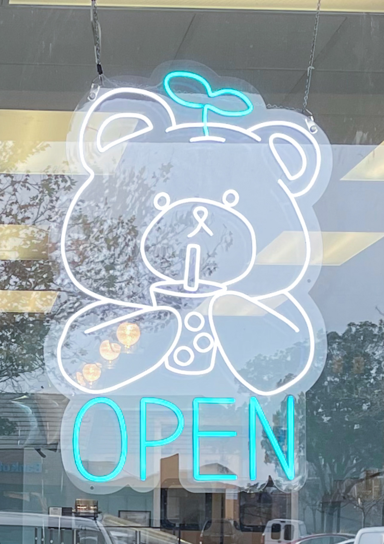
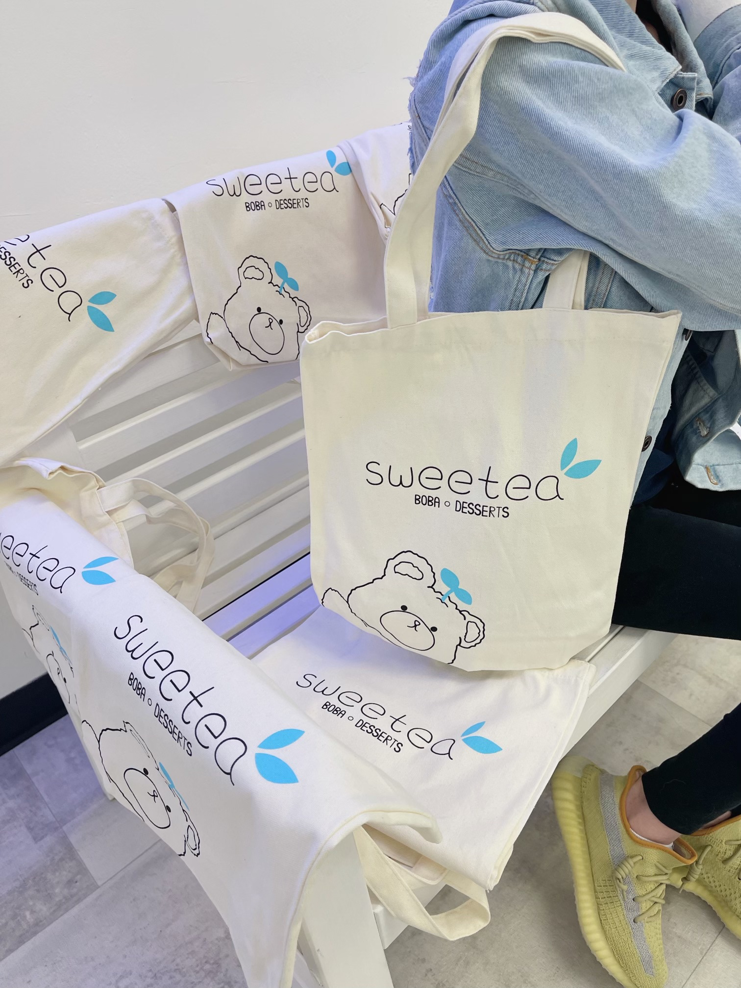
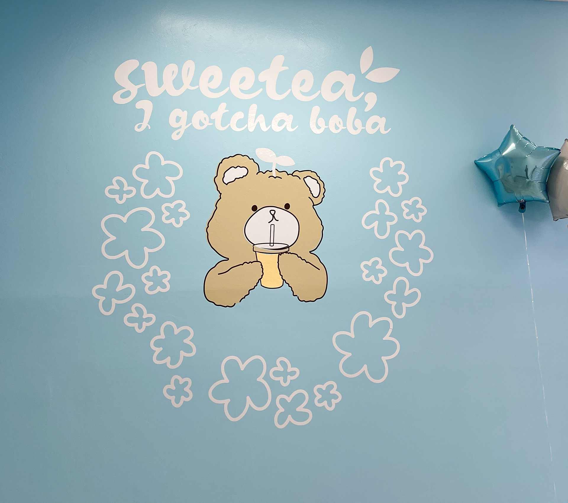
A bear mascot was chosen and eventually complimented the bear lids found on the drinks. The addition of the leaves on the head were done to represent the tea and the idea of fresh ingredients. Pastel brown and blue were used to amplify "cuteness" and "sweetness."
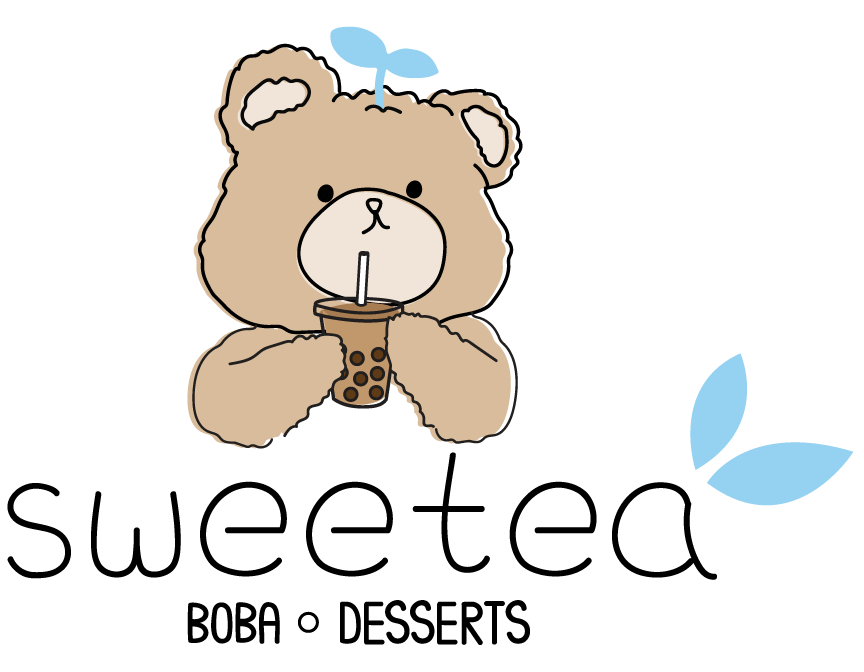
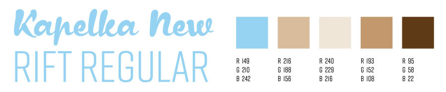
Typeface & Color Palette
The main fonts used are a handwritten script and a thin sans serif. Other than the standard brown colors of the bear, a pastel blue was chosen as the primary color for the brand to emulate the feelings of soothing as you usually get a drink to relax.
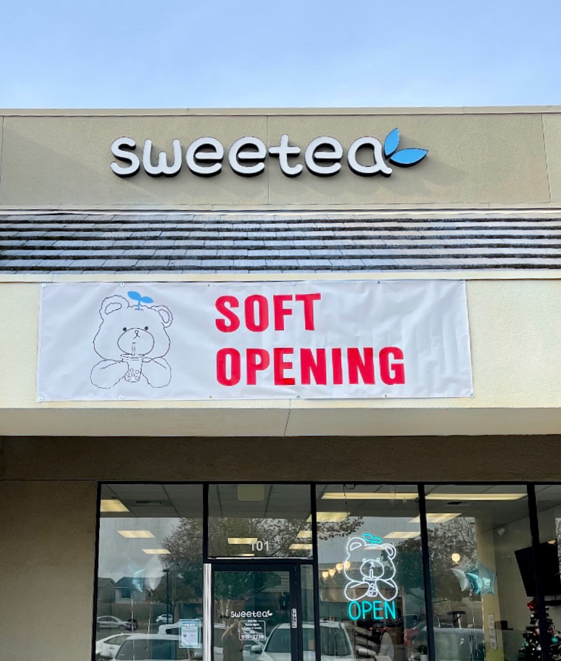
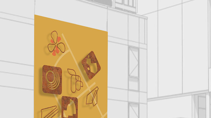
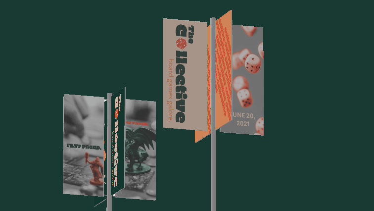
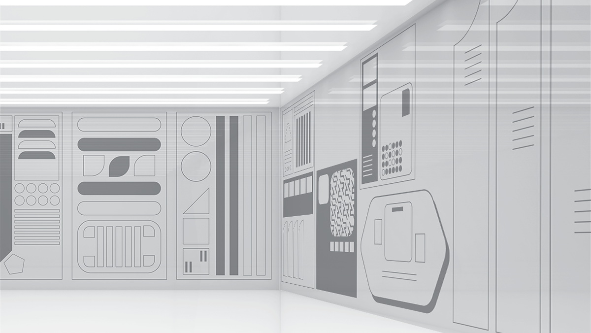
Final Applications
With the foundational elements created and decided on, various deliverables to make the brand successful were created. Aspects like advertising graphics, tote bags, murals, and signs were made.